Gösta Åbergh

I’m a Senior Product Designer with a background in design leadership and a passion for creating meaningful user experiences. I’ve led teams with empathy, focusing on empowering individuals by recognizing their strengths and supporting their growth.
Outside of work, I’m a parent to twins, a board game enthusiast, and hope to one day create a game of my own. I once learned Czech to study at FAMU, Prague’s top film school—an experience that reflects my curiosity, persistence, and love for creative challenges.
Com Hem
Customer Service – Support
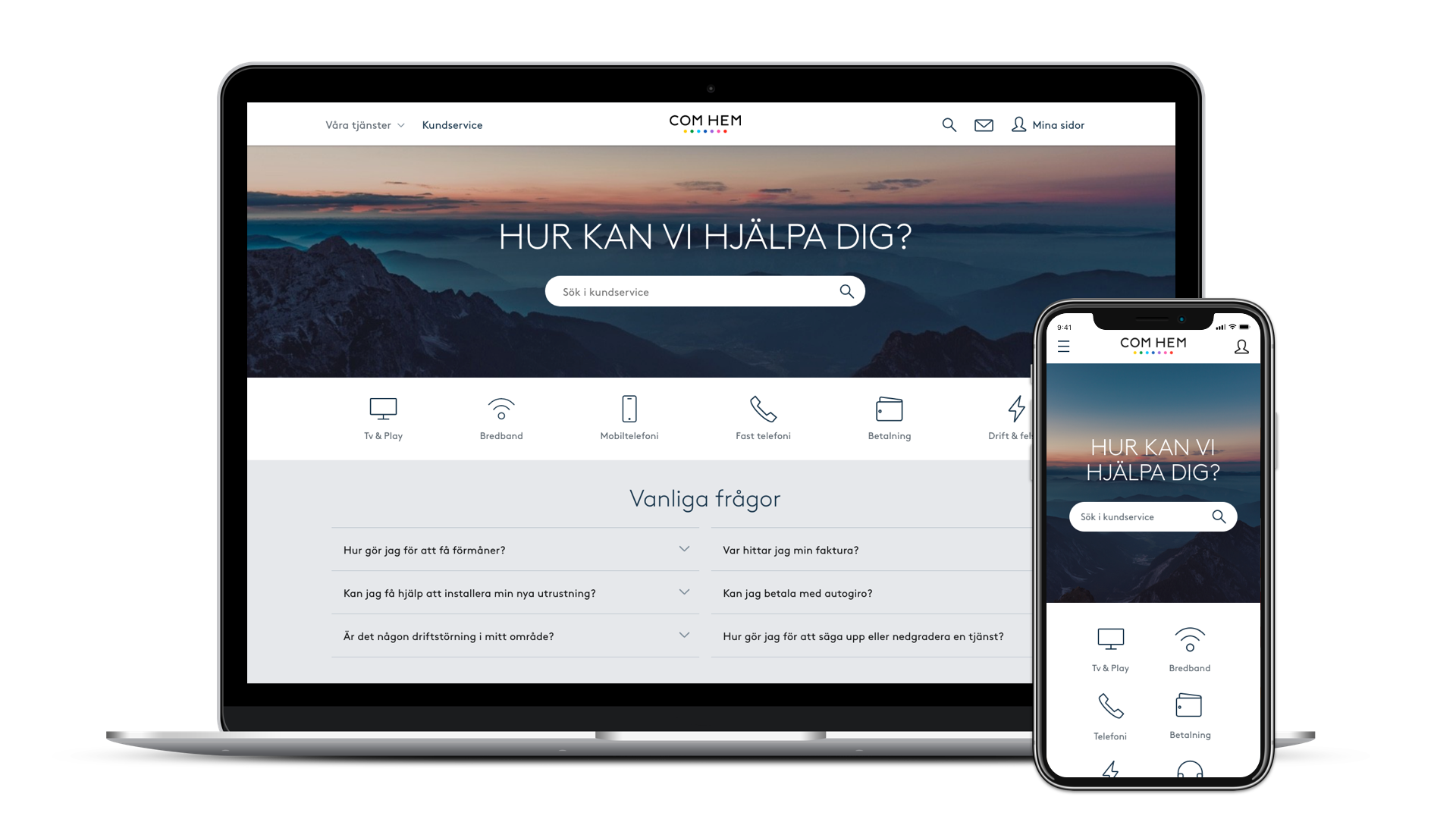
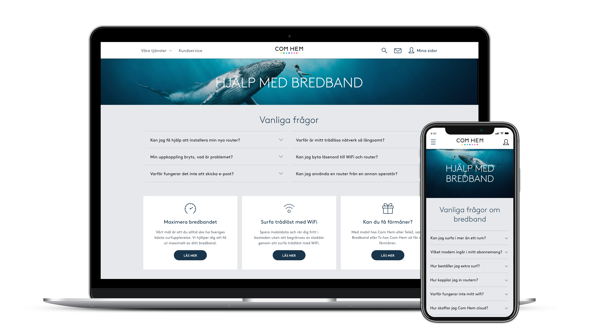
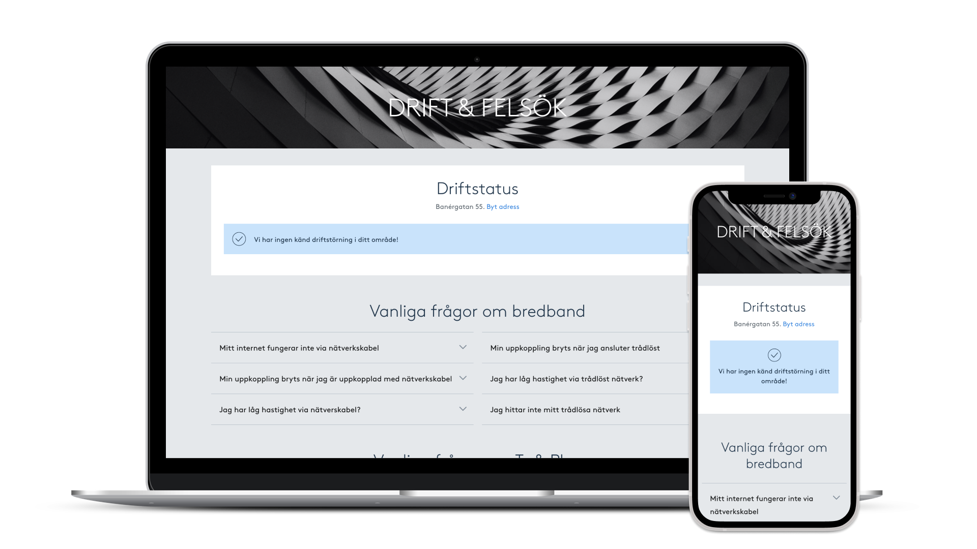
When redesigning the Customer Service pages, our goal was to help users quickly find the info they needed to solve issues on their own. User testing showed different preferences—some wanted to browse, others to read or contact support—so we focused on improving navigation to support all paths.
My contribution:
- Concept and Visual Design
- Hypothesis for User testing
- Information Architecture
- Guidelines and branding
- Design System
https://www.comhem.se/kundservice
https://www.comhem.se/kundservice/bredband
Com Hem
Purchase flow – Broadband
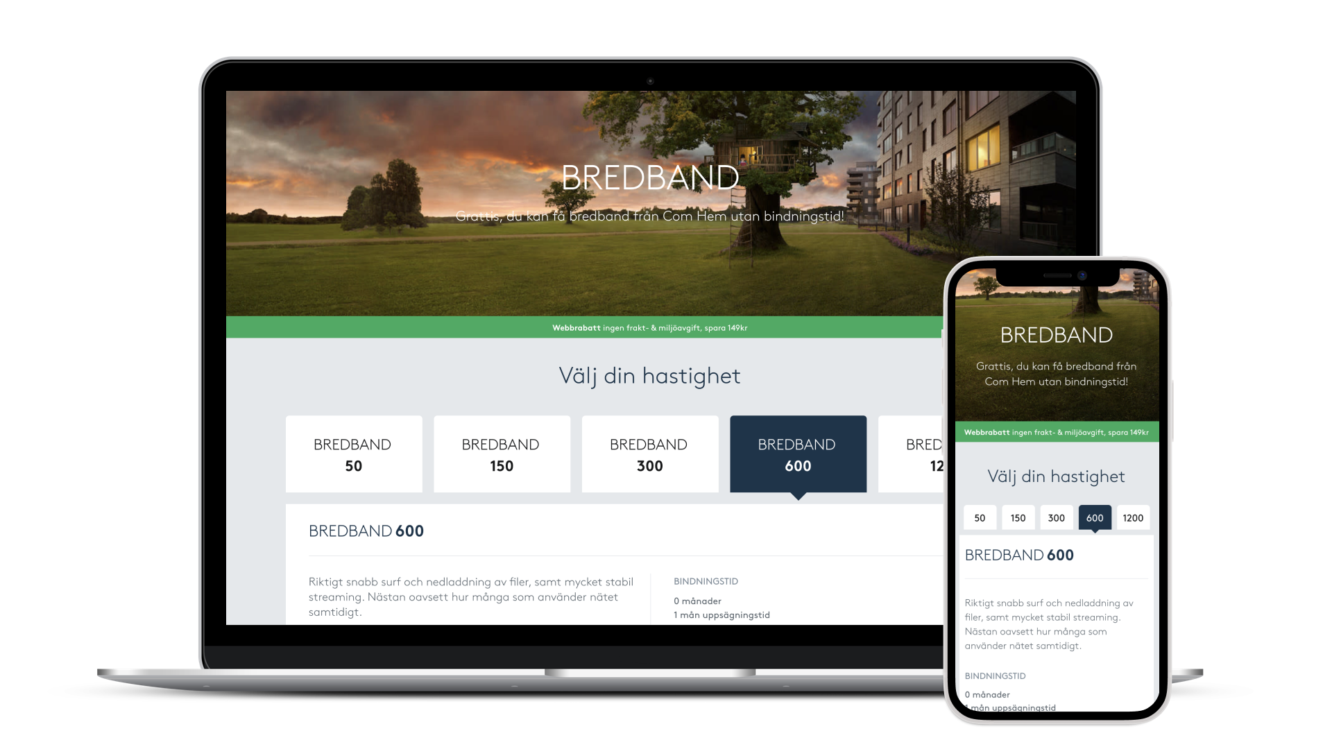
Buying broadband was confusing—customers struggled with unclear pricing, ineligibility issues, and poor comparison tools, leading to high drop-off rates. By simplifying the flow and improving pricing transparency, the redesign led to a 24% increase in online broadband sales revenue.
My contribution:
- Concept and Visual Design
- User Experience and Information architecture
- User testing
- Concept proof of viable, desirable and feasible product.

Com Hem
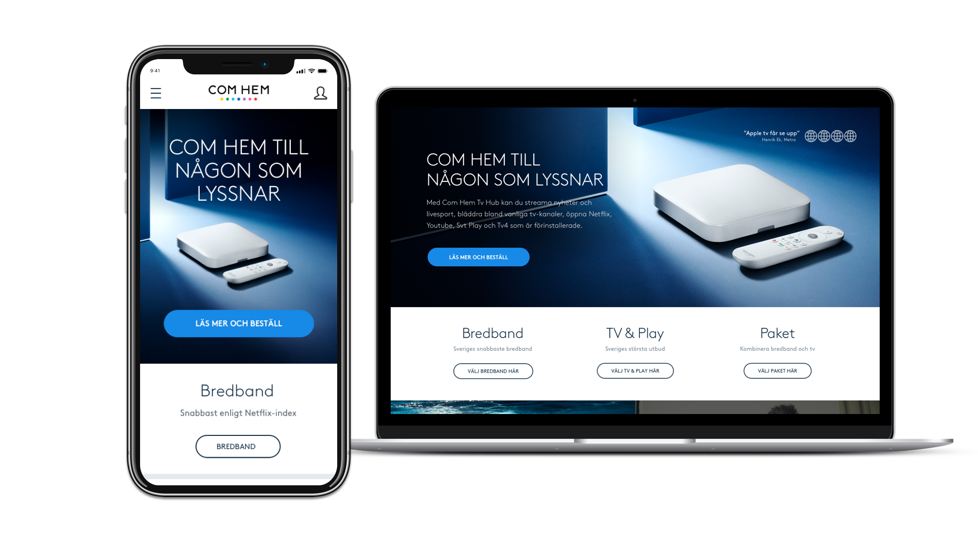
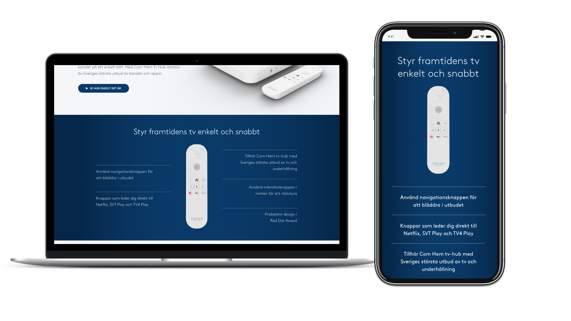
Campaign – Com Hem Tv Hub
With the launch of our new TV box—a major upgrade from TiVo—we needed to clearly communicate its benefits, despite it lacking a much-loved recording feature. The challenge was not just promoting the product, but also shifting customer viewing habits. Thanks to strategic design and messaging, the launch was a success, with 369 units sold online in just the first five days.
My contribution:
- Concept and Visual Design
- User testing
- User Experience
- Information architecture

Tele2
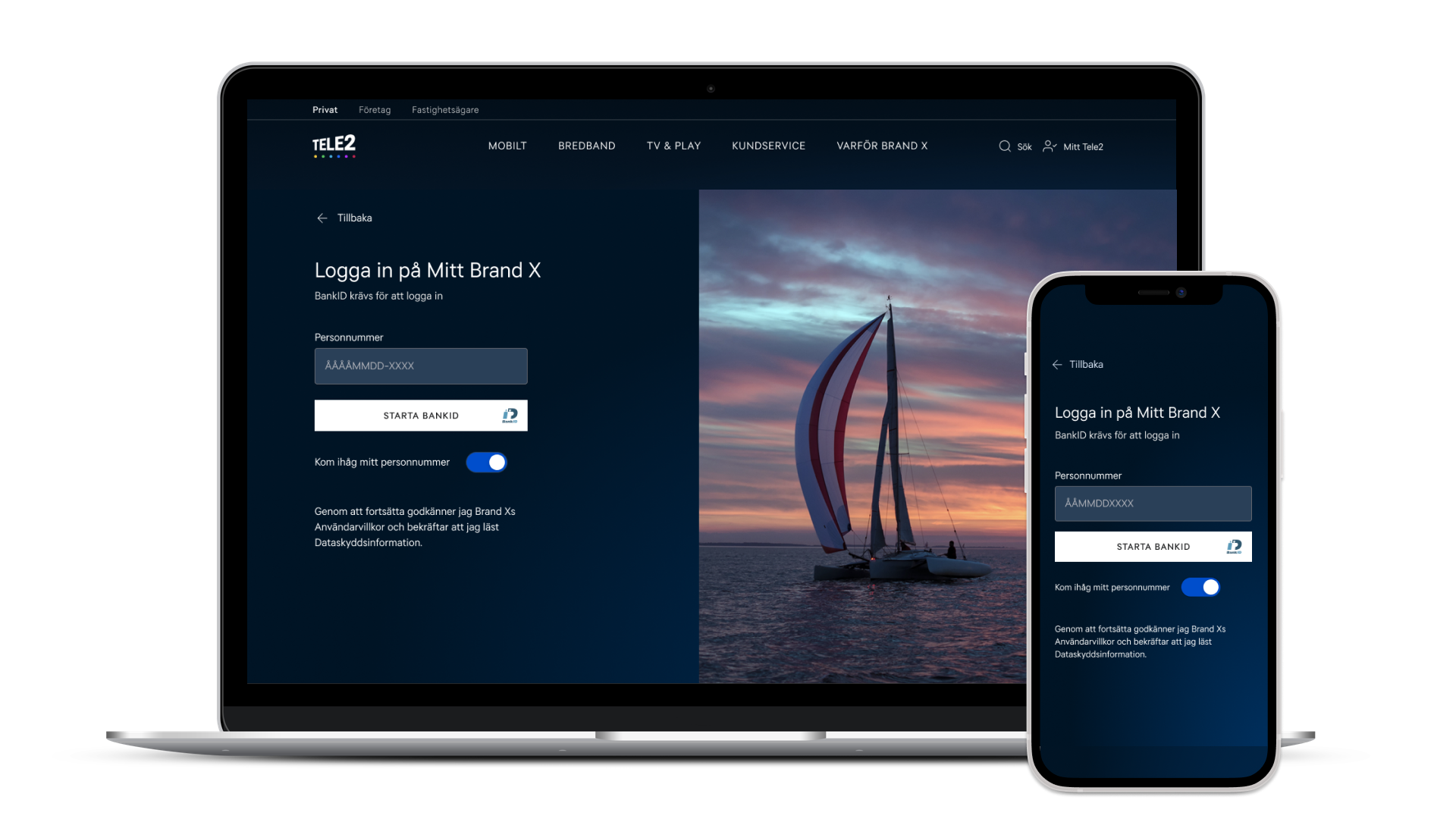
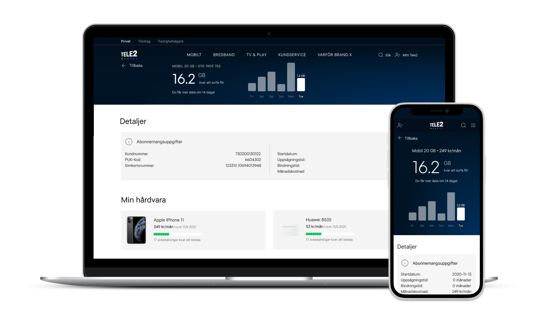
E-care
Merging Com Hem and Tele2 meant tackling both technical and brand challenges. The goal was a unified experience that felt familiar to existing users and appealing to new ones. Close collaboration ensured smooth integration and consistent brand messaging, enabling a fast and successful launch.
My contribution:
- Research, Concept, Information Architecture and Visual Design
- User Experience
- User-testing and prototyping
- Branding

Tele2
Mobile Application
This project went beyond rebranding the Tele2 app—it meant integrating Com Hem products while elevating visuals to engage existing users and reflect a competitive telecom market. User testing was key to aligning design with customer needs and business goals.
My contribution:
- Research, Concept, Information Architecture and Visual Design
- User Experience
- User-testing and prototyping
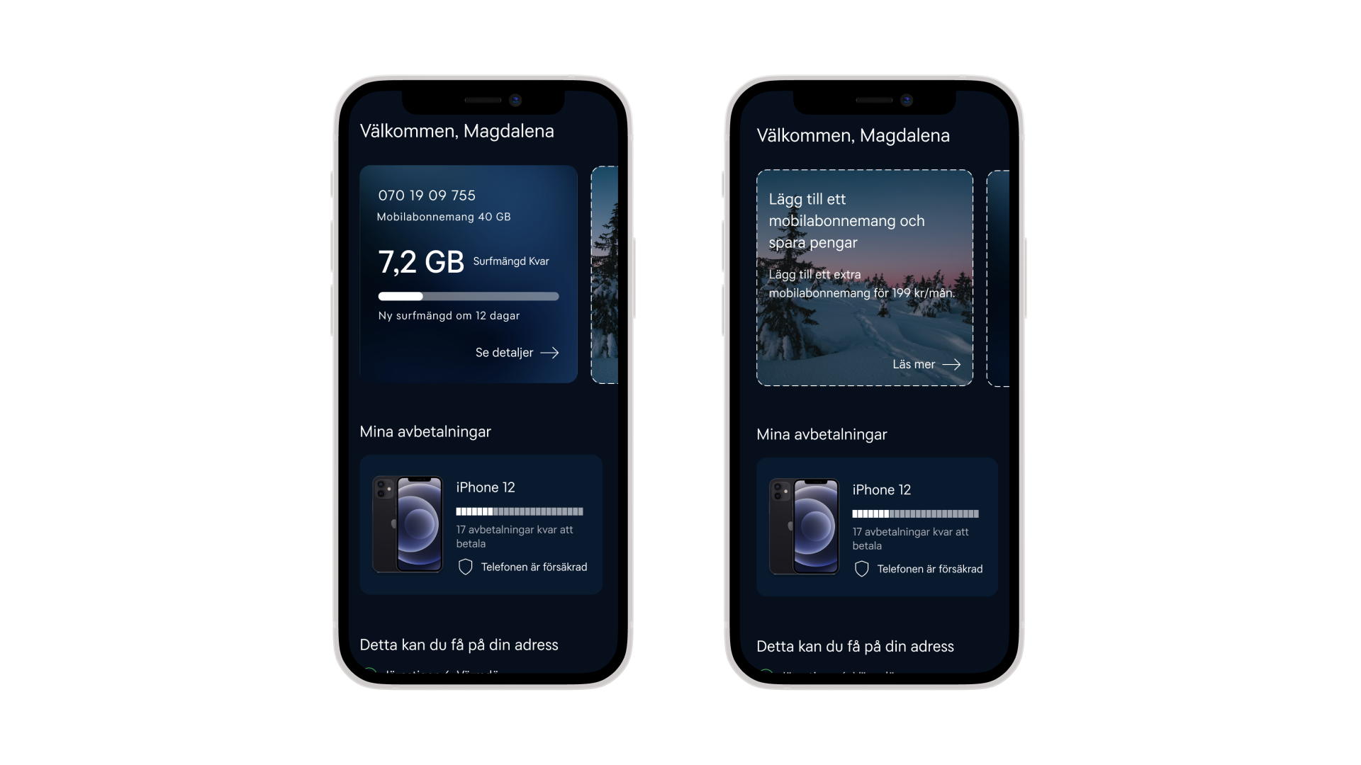

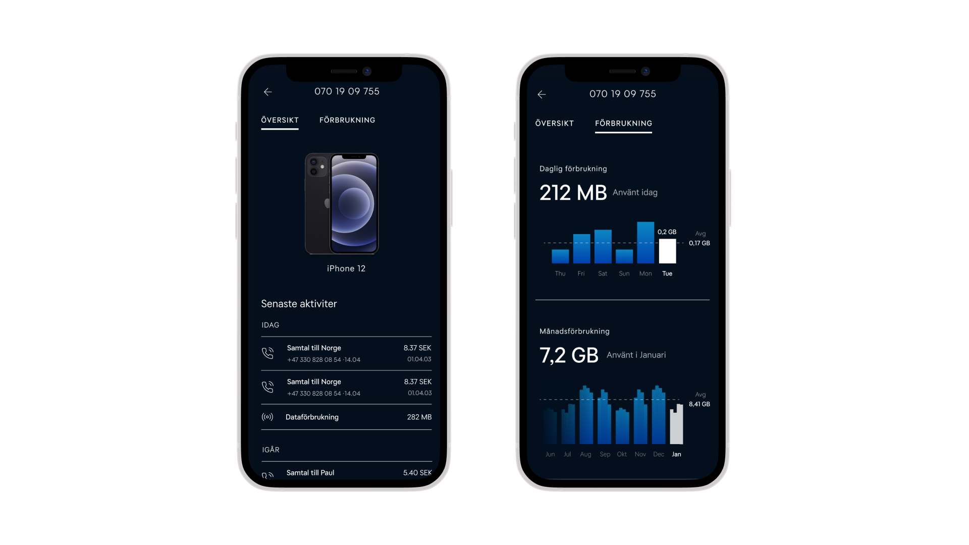
I want to clarify that while I didn’t create the video below itself, all of the content and screens used in the video were sourced from my work on the Tele2 app:
Ycons
Mobile Application
At Ycons, a company selling wallpaper art by global artists, I worked on designing a premium e-commerce experience that highlights each artwork and makes browsing and purchasing seamless and inspiring.
My contribution:
Nordic Outdoor Adventures
Mobile Application
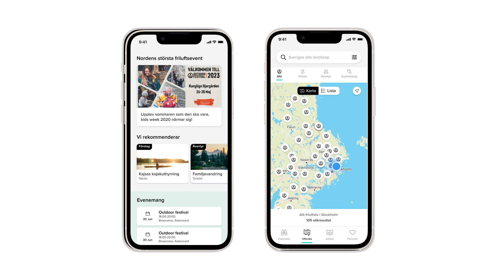
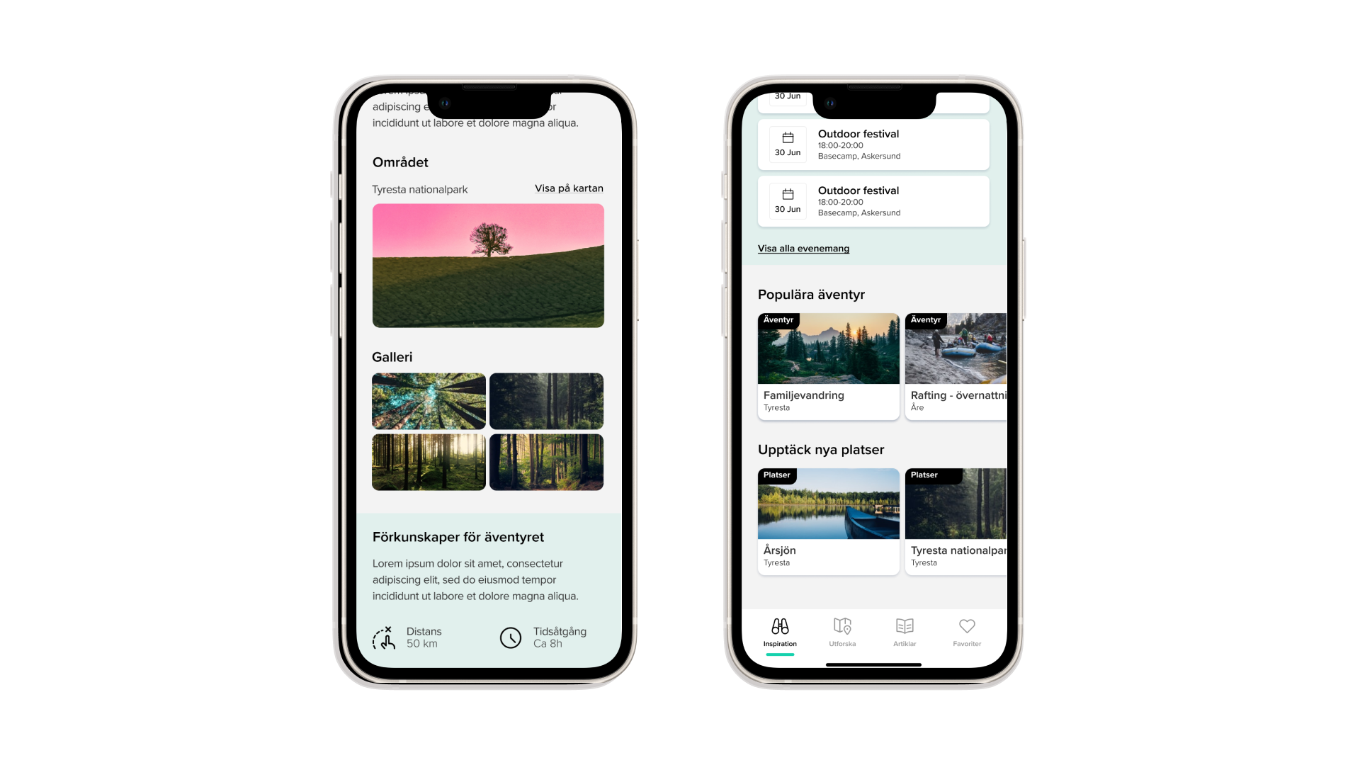
I redesigned the Nordic Outdoor Adventure app to improve usability and visual clarity. By simplifying the navigation, grouping related info, and refining the color palette, the app became more intuitive and engaging—encouraging users to explore the outdoors.
My contribution:
- Research, Concept, Information Architecture
- Benchmarking
- Visual Design
Thank you
I hope you had a pleasant visit. Before you go, feel free to reach out—I’d love to hear from you via email.


